Hello everyone! I am here to give you some tips on CLUSTERING!

Let me start by saying that clustering is all about personal preference and there is absolutely no wrong or right way to do it. Just play around, have fun and create something that you love.
With that said, I am gonna show you the tips and techniques that I personally use when I am creating clusters. I LOVE creating clusters and I include them in one way or another on almost every single layout I create.
For me, there are 3 important parts to clustering.
1. Placement
2. Size
3. Shadows
These 3 parts are geared towards the cluster as a whole. So for the sake of complete beginners, lets start with making our own cluster!
To aid us in this endeavor, I made a template for ya =) It is just a photo spot and cluster, so feel free to put in on any type of background that you choose.
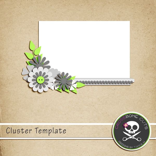
Download the cluster template
HERE.
And here is how I went about making my cluster. I used Photoshop CS4 for my screenshots.
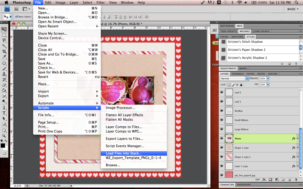
I went ahead and placed my papers and photo. Then I used the Load Files Into A Stack script, I use this in photoshop so that all the elements I want to possibly use are all in one file. In PSE you would just open your elements into your project bin.
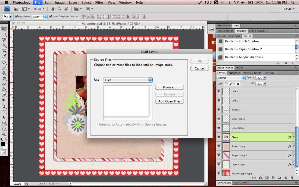
Click on Load Layers Into A Stack:
This box will pop up so you can browse for your elements:
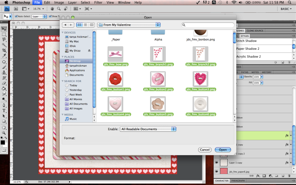
Find your kit folder and select all the elements that you might want to use:
Now all the elements I chose are in one file for me to drag onto my layout when I need them:
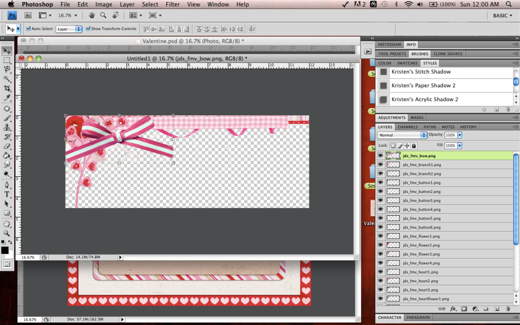
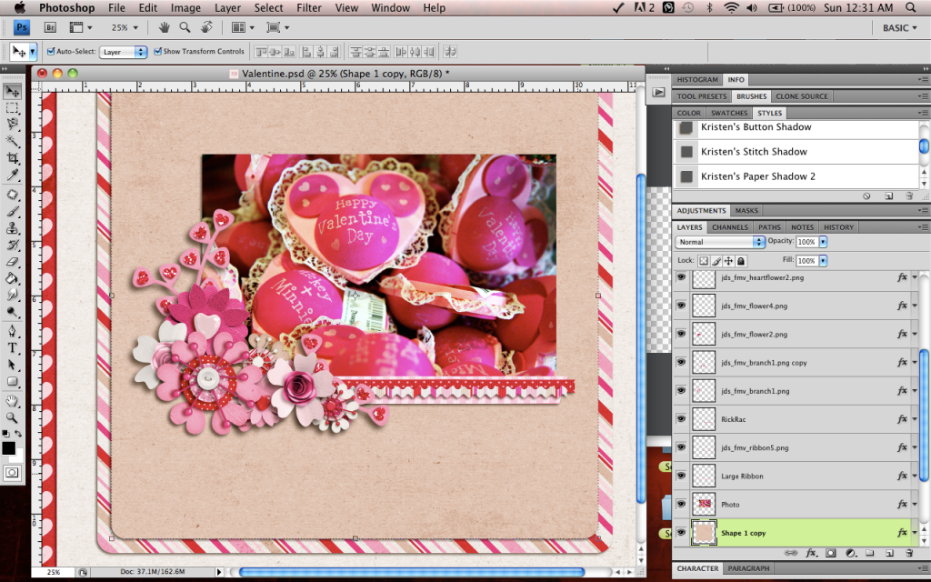
Now, using the template as my guide, I am gonna start placing my elements. You can do this in any order you wish. I usually start from the bottom and work my way to the top. So I am gonna start with my leaves, applying a drop shadow style to each element as I go:
Now I move on to my ribbons. Sometimes I like the way the ribbon shape on the template is shaped better than my actual ribbon, which is the case with my big ribbon. So I am gonna leave my ribbon the size it is and place it over the "large ribbon" layer of my template:
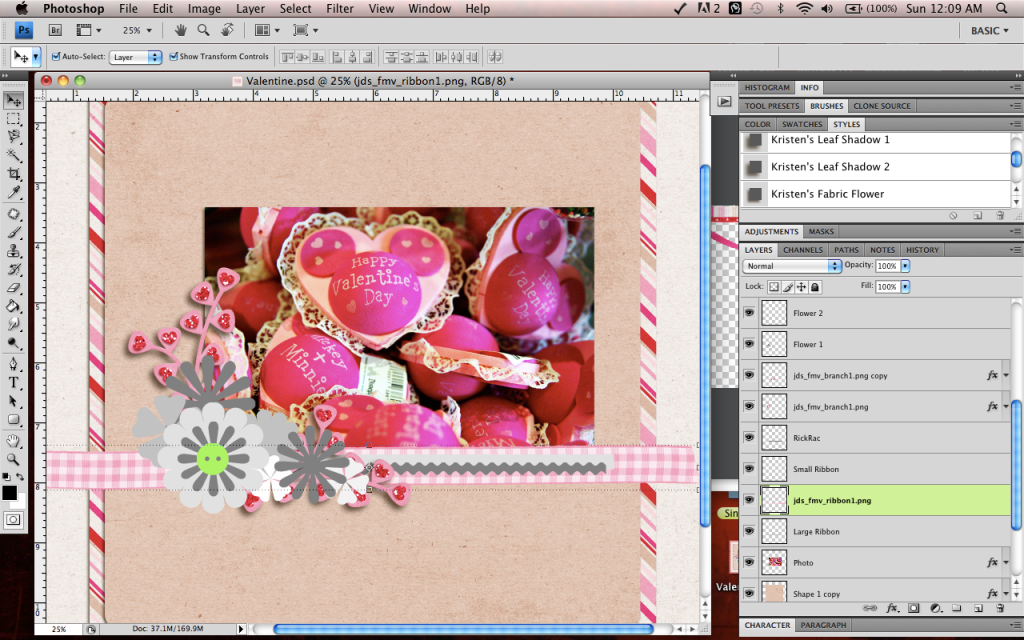
I will then clip the ribbon to the template layer:
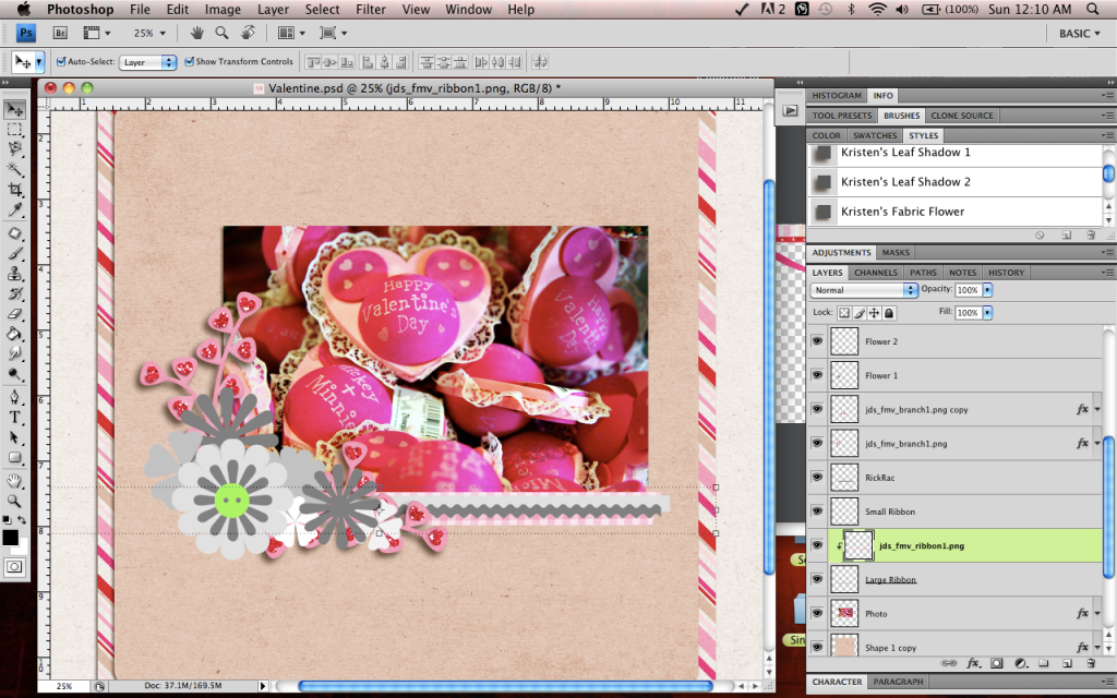
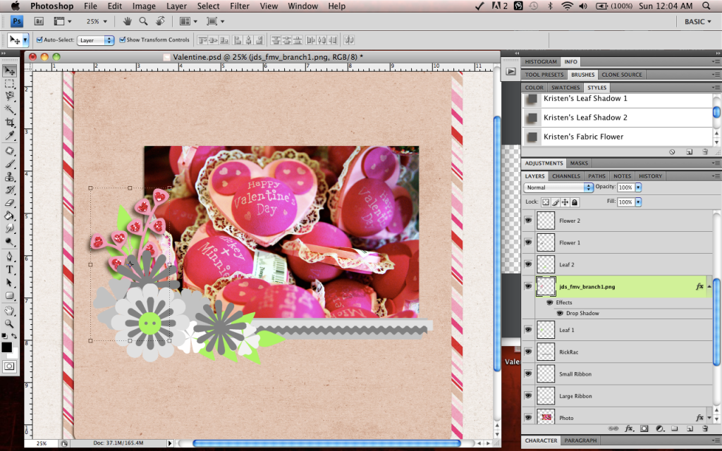
I will then continue placing my elements until I feel my cluster is to my liking:
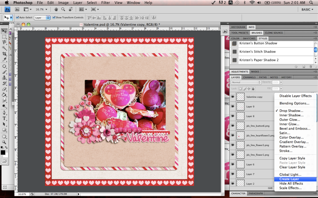
After I add my title, I am gonna move onto my shadows. Shadows can really be a WHOLE lesson on their own. There are sooo many different techniques and tricks that it can really be super confusing at times. I will show you what I do for shadows.
I apply a basic shadow style that I bough to each element as I place them. After my layout is done, I then work on my shadows. In PS (this does not work in PSE), right click on the "fx" symbol in a layer and then select "Create Layer":
Now your shadow is on it's own layer. Select your shadow layer and change the Blend Mode to "Linear Burn". This just makes your shadows look more realistic. You might then need to play around with the opacity because choosing this blend mode can make your shadows crazy dark sometimes:
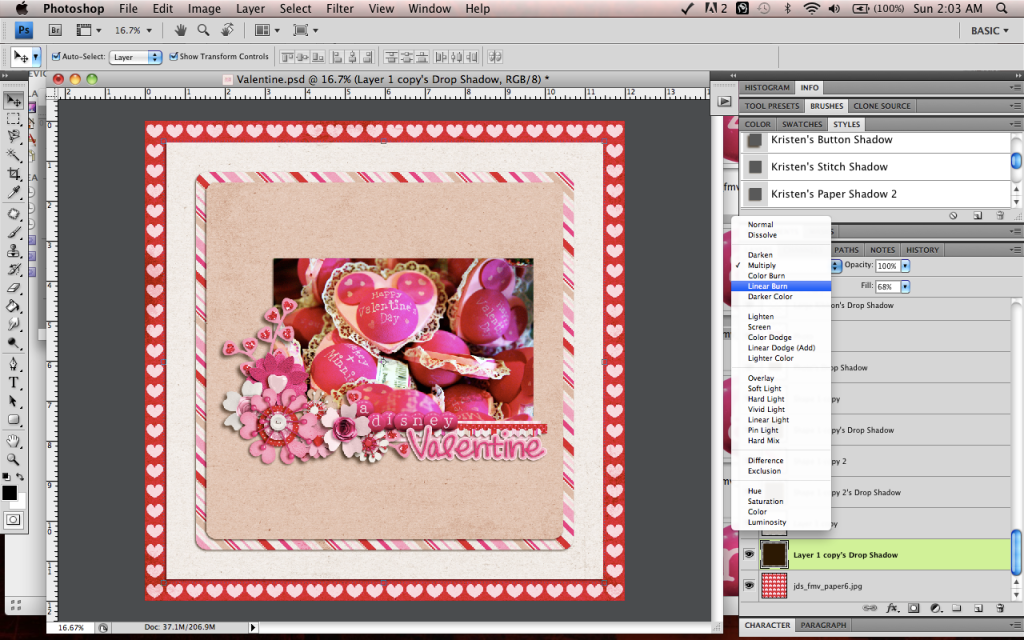
After that, I just use the arrows on my keyboard to move the shadows around a little bit if I want them to pop more.
AND here is my finished layout:

Here is another really good tutorial about making a cluster:
How to Guide for Clustering
So Now that your cluster is made, lets talk about the other aspects of clustering starting with
Placement.
Again, these are just guidelines and not the "only" way to do these. Most of the clusters that I put on my layouts fall under one of these 3 placement categories:
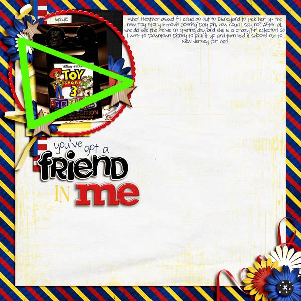
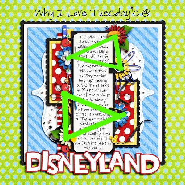
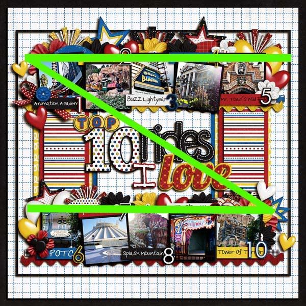
Triangle. Which is what I use the most:
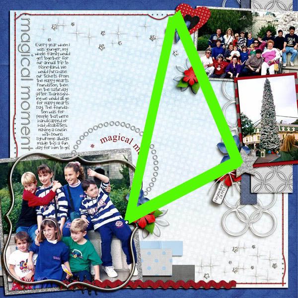
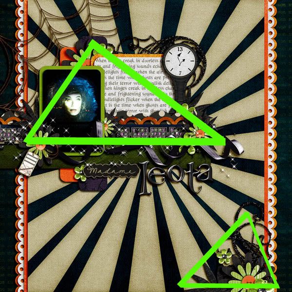
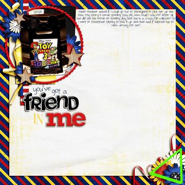
Even mulitple triangles on a page:
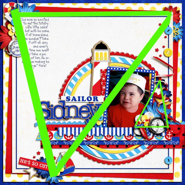
My individual clusters even follow the triangle shape:
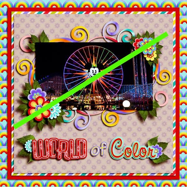
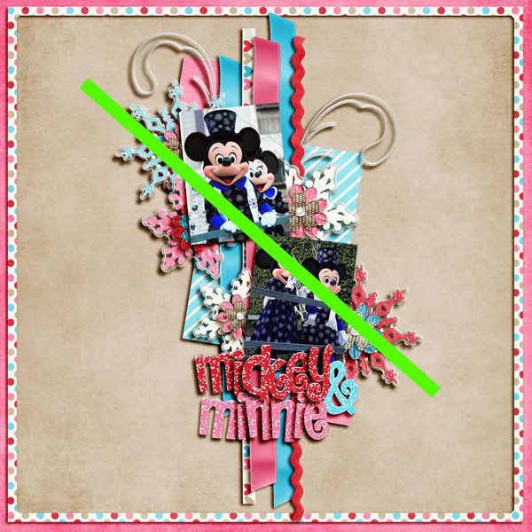
Diagonal:
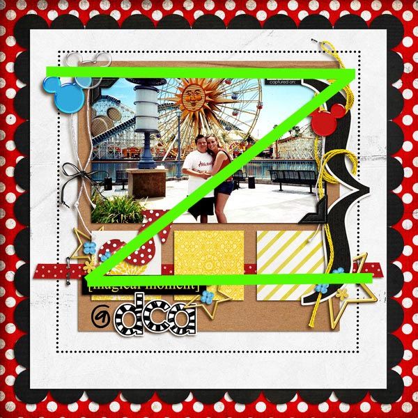
"Z":
Again, you do not need to follow any of these guidelines if you don't like. They are just there in case you get stuck on where to place your clusters.
Size
When determining the size of your cluster (or any elements for that matter) you have to think about the size they are in real life. Most of us love the ease of digi scrapping but still like our layouts to have that "paper scrapped" feeling. So when you are playing and re-sizing your elements, you want to think about what they would look like if you placed them on a actual paper page. For example, a staple. In real life a staple is usually no bigger than a 1/2 inch. So this is what size your staple should be on your digi layout as well. Just keep that in mind while making your layouts.
Shadows
Instead of trying to explain this one to you, I am just gonna give you a link for a tutorial that really helped me understand shadows. lol.
For PS:
The Shadow Files
For PSP:
The Perfect Shadows
I have a style set using my own personal shadow settings in case you are interested as well!

Hopefully this tutorial has been a bit of a help to you. Feel free to ask any questions. There are a ton of people in this community that have a ton of knowledge to share!